Seeing a class divide through typography – how visual representations of Urdu have shaped how Pakistan thinks about technology, progress, and innovation
Lahore is often referred to as Pakistan’s ‘cultural capital’ – stereotypically classified as such due to its patronage of theatre, film, and the arts in general. It is also the historical capital of the Punjab province. Punjab was split into two during the partition of the Indian Subcontinent, and Lahore continues to serve as the capital of Pakistani Punjab. A city of over 11 million, Lahore is home to native and migrant populations from across the country. It also served as one of the entry points for migrants who travelled across the new border in 1947. Despite this status as host to migrants however, Lahore is a city of Punjabi speakers. On any street, in any rickshaw, at any tandoor, or on stage, you will hear Punjabi.
Yet as one travels across Lahore, roads, shops and buildings when labeled tend to be labeled either in Urdu or in English. Urdu was declared Pakistan’s national language and is perhaps the only remaining language with any strong formal written tradition of Pakistan’s many languages (not counting English). Urdu signs, compared to English, are more often hand-painted. While the English signs display an expected cacophony of visual styles and typographic choices, corresponding Urdu signs (the mechanically or digitally typeset ones) seem to often use just the one font.
But the choice of English is curious, because despite its desire to be a tourist hub Lahore is not, and only a small minority of its population would be considered literate in English let alone conversant. Granted Pakistan’s education system is so bad that less than half of third graders can read a sentence in Urdu or any other local language. Only a third can write a sentence with the word ‘school’, and only a third of that can do so with English (see this report on Pakistan's educational status from the World Bank).
Pick up Pakistan’s largest Urdu newspaper, Jang, and often the front page will have a half-page ad about a new developmental project. These have become a familiar sight especially after the announcement of the China-Pakistan Economic Corridor which is bringing new money to the country’s infrastructure. And incredibly often this ad will be typeset in English.

Jang Lahore front page, March 27 2018
Pakistani parents demand their children be taught English at schools, since English “is the language of the elite and the global marketplace”. Private schools, especially the elite ones, tend to be ‘English-medium’. This, despite the fact that 94% of private school teachers do not know English.
The English-medium/Urdu-medium duality is more than a description of education systems however. It describes two distinct sections of Pakistani population. While the use of the terminology refers most directly to educational systems, it also refers to cultural appropriation, cultural belonging and societal class. At a music festival in Lahore earlier this year, my father commented for example, that there was a clear separation between the English-medium and Urdu-medium members of the audiences. The event itself was run by English-medium professionals and college students, but partnered with local government bodies. I know from my work with the organizing committee, that specific attention was paid to bridge the gap. The organizers committed to being able to bring in English-medium audiences while they requested the government helped them reach out to the Urdu-medium. This expressed not just a desire to bridge the gap on behalf of the organizers, but a recognition of their own inability to the gap towards and lack of access to a significant fraction of Pakistani population.
In August of 2015, Pakistan’s Ministry of Planning, Development and Reforms launched an ‘ILM Pakistan Movement’. Part of this initiative was the conception of an ‘Urdish’ medium of education. The minister, Ahsan Iqbal, was paraphrased as follows:
Under the new initiative, said Mr Iqbal, the government would get rid of the English medium-Urdu medium controversy which had damaged the education standards and adversely affected the growth of young minds in contrast to the world practice of educating children in their native languages.
He said the ‘Urdish’ medium of education would be introduced by adopting terminologies of science and technology instead of using their translations and blend them with common Urdu narratives to make it easier for students to learn.
It is hard to tell, as with most announcements from the Pakistani governments, what came of this initiative. But certainly this was not the only moment such a scheme was suggested and it is unlikely to be the last. Critical to us in the narration of this initiative is the governmental acknowledgement of the English-medium Urdu-medium divide, a claim that this divide is in fact at least partly to blame for poor educational standards, a conceived relationship between the duality of English and Urdu as rival educational systems in a society where most speak neither natively, and the conception of a renewed system where Urdu becomes the dominant language of education but is supported by the use of English technical vocabulary.
Why is it that despite acknowledgement of the importance of native language, that most of Pakistan’s native languages are still ignored in an idealization of Pakistani education systems? How is it that a language with a thriving written and spoken tradition, one that found itself spoken in Mughal armies, then in courts finds itself unable to provide technical vocabulary for modern science and technology? Why is it that the idea of the Urdu language with adopted technical vocabulary has to be conceived not as Urdu but as a new form of language: Urdish? How is it that a government – and it appears a society at large – demand that their children develop fluency in English (at least with technical vocabulary but hopefully with more) when even private school teachers let alone public school teachers and have no capacity whatsoever to make this happen?
My argument is that the explanations for these questions are not entirely political or sociological – but also, if not primarily, technological. The seeming inability of Urdu to adapt to technical vocabulary, the lack of any imagination where Urdu can sustain Pakistan’s children in a world of science and technology, the blind hope that we will find a way to teach our kids English successfully, and the growing divide between the haves and have-nots of Pakistani society on the lines of language can be linked back directly to the availability of technology, and its ability (or largely inability) to represent local linguistic tradition in respectable, acceptable, and accepted form.
※
Notes on the Urdu Language
A history of the Urdu language has been better established in much other literature, but I mention some important facts here to contextualize the rest of the essay.
Urdu is an Indo-European language largely spoken in South Asia and by South Asian diaspora across the world. It can be considered a formalized register of the Hindustani language, of which the other formalized register is Hindi. Hindi and Urdu are mutually intelligible, apart from specialized vocabulary. Hindi is written in the Devanagri script, while Urdu is written in the Arabic script.
Depending on how one counts, there are around 70 to 100 million people that call Urdu their mother tongue. The majority of these reside in India, with the rest largely in Pakistan. Most Pakistani native Urdu speakers migrated from what is now India to Pakistan at partition and established base in the country’s urban centers. Since Urdu is however the lingua-franca of Pakistan – declared as the sole national language soon after independence from the British and partition of the subcontinent – it is understandable to most of Pakistan’s over 200 million strong population. Given its mutual intelligibility with Hindi it is also understandable to large parts of India’s population, and together Hindi and Urdu form the world’s third largest spoken language after English and Mandarin Chinese.
The separation of Hindi and Urdu has deep political context in India and Pakistan, with both languages despite their shared traditions and linguistic similarities being chosen to represent the national and cultural identities of the newly formed nations. While Urdu remains one of India’s official languages, Hindi is granted precedence, and the choice of separating the two languages by official status and vocabulary in modern times is driven in no small part by political motive. There is great depth of literature that discusses the shared and separated histories of Hindi and Urdu, but for our purposes (in very simplified form) it suffices to know that their politically separate forms source their vocabularies from two separate linguistic traditions: Urdu from Persian and Hindi from Sanskrit. Since partition, many regional languages in Pakistan such as Punjabi and Sindhi which might otherwise have been written in the Devanagri script have primarily used the Arabic script. As such the Devanagri script holds little sway in modern Pakistan but it is also arguable that the artificial imposition of script has damaged the written tradition of regional languages that may not have traditionally been written in Arabic script.
※
Repeating Histories of Rejected Typography
The Gutenberg Bible was published in 1454. Shortly after this printing presses proliferated across Europe. The earliest known Hebrew printing began in Constantinople in 1493. Over the next one hundred and fifty years Constantinople saw the printing of other scripts as well: Armenian and Greek (see Osborn, J.R. Letters of Light 104-5). Yet it took nearly three hundred years after the Gutenberg Bible, until 1727, for the first Muslim print shop to be established in Constantinople (Osborn, 10). It is not that the technology didn’t exist, the first known use of Arabic movable type was in 1514 (Osborn, 86).Constantinople was a political center of the Ottoman Empire at this time, so why is it that it took so long for the Muslim world to adopt print?
Before answering this question I would like to tell another story. Three years after Pakistan’s independence, the Government of Pakistan established the Government Press of Pakistan. This press recruited the technology of the time, such as the Monophoto, which was released in 1952 shortly after the establishment of the press in 1950 (Nemeth, Titus. Arabic Type-Making in the Machine Age, 107). In 1957 the Pakistani government ordered Arabic fonts for the Monophoto, indicating their desire not just to print in Arabic script but to move forward the development of the Arabic script in printing technology (Nemeth, 213).
Despite this early attempt at establishing a typographic tradition, Urdu newspapers continued to not be typeset in Pakistan until almost three decades later. During this time Urdu newspapers hired armies of calligraphers that would handwrite every story on every page, to be compiled into one standard copy that would be lithographed every day. Certainly again, the technology existed – so why did Urdu newspapers persist in refusing to typeset?
The similarities in both stories are striking, and I tell them both because it is easier to fathom rationale in the more modern story, and in contrast easy to write off the older example to political and religious irrationality.
The traditional explanation for why it took so long for the Muslim world to adopt print was that Ottoman leaders and religious authorities were against printing. There are various supporting rationales for this argument, perhaps the most simple of which is that free information threatened the authority of the both the clerics and the state, and so the state’s muscle was used to prevent any printing.
JR Osborn, in his book Letters of Light, challenges this viewpoint. Among various challenges of historical accuracy, he further questions how an Ottoman state arguably so powerful and autocratic would allow printing in other scripts if it found printing distasteful enough to (as they are said) punish anyone printing in Arabic with death? Instead Osborn proposes a different set of rationale for why the Muslim world avoided printing for so long. The first explanation is religious. The most important text of the Muslim world, the Quran, was distributed via a dense scribal practice that emphasized strong institutional practices of ensuring accurate reproduction of text. As such, the handwriting of Qurans allowed more careful monitoring of each copy of the text, and reduced damage from potential errors which could be corrected by amendment. Printing would amplify errors in transcription to unfixable degrees. In a tradition built around protecting the sanctity of the Quran in its agreed form, this was incredibly important (see Osborn 76-83).
A further rationale – not presented by Osborn but adding to his point about intellectual tradition – for why the Muslim world may have been slower to adopt print is the different cultures of intellectual practice in the Muslim world as opposed to Europe of the time. Like the calligraphers, intellectuals of the Muslim world during this sixteenth and seventeenth centuries do not imagine the institutions of learning only as providers of access to information, but also providers of access to people of learning that can provide training in addition to information. The role of a teacher in this practice supersedes the role of a book, which provides another reason why printing gains less traction in the Muslim world than it does in Europe shortly after Gutenberg.
But Osborn’s critical claim is not cultural but technological. The scribal tradition of copying the Quran was also the mode through which the aesthetic language around the Arabic script was developed. As representation of the word of God, Arabic calligraphy of the Quran demanded beautification that required artistic integrity and flair. Printing the Quran in movable type required the simplification of this aesthetic tradition into a representation of the Arabic script that lost its rhythm, variability and hence aesthetic quality (Osborn, 83-111).
And it is this argument that brings us back to Pakistan’s newspapers. Despite decades of font production by the foundries of the time, Pakistani newspapers refused to adopt them to typeset their text. Notes narrated by Titus Nemeth, in his study of typesetting in the Arabic script, repeatedly showcase that the reason for these refusals was that the typographic style would not be acceptable to the newspapers’ audiences. Specifically the rationale was not that the typographic styles were different, but that they inaccurately represented the stylistic expectations of the Pakistani population. As a result it was unworkable for Pakistani newspapers to adopt typesetting until the development of such fonts that would accurately represent the nastaliq calligraphic style that Urdu is written in. This is further evidenced by the fact that when the Jang newspaper finally switched to the typeface they use to this day, they had to announce it by printing an issue with handwritten and typeset text side by side, showcasing once and for all that this representation would meet the expectations of Pakistani audiences which had required the army of calligraphers up to this point (Nemeth, 148-155, 213-219).
※
Notes on the Arabic Script
To understand the nuances of why typesetting in the Arabic script is difficult, it is worth noting some basic facts about the Arabic script. Like most introductions in this essay this has been simplified from other literature for brevity and simplicity.
The Arabic script is a phonemic writing system, as opposed the other major category of logographic writing systems. This implies that the individual glyphs of the Arabic writing system represent phonetic sounds. So the written form of the script indicates to the reader how to pronounce a word, regardless of whether or not they are familiar with the word. The Latin script, like other alphabetical scripts, is similarly phonetic. Logographic scripts on the other hand, consist of graphical units that correspond to words or meaningful parts of words. The dominant examples of such a system today would be Chinese, Japanese and Korean, where each character represents not a fundamental unit of sound but a word or a component of a word.
Unlike the Latin script however, the Arabic script is not a true alphabet, but an abjad i.e. the primary symbols of the Arabic script cover only consonants, not vowels. Vowels are optionally indicated as a separate layer of diacritics. Most written Urdu for example will not contain diacritics until explicitly meant for instructional purposes. But a Quran that is bought in Pakistan – to be read largely by audiences familiar with the Arabic script but not Arabic itself, would contain diacritics to indicate correct pronunciation.
At its core the Arabic abjad consists of 21 basic shapes, or rasms. Each rasm can then be annotated with optional ijam to indicate separate consonants that share the same basic shape. For example the horizontal bowl shape with one dot underneath – the ب – corresponds to the ‘b’ sound. The same letter shape with three dots underneath – the پ – corresponds to a ‘p’ sound. The total number of letters in any language that uses the Arabic script depends on how many variations of ijam are added to the basic rasms. Urdu combines to a total of 39, Sindhi to 50 (where I have not counted digraphs – pairs of letters that combine to form a different sound than the expected combination of the two letters).
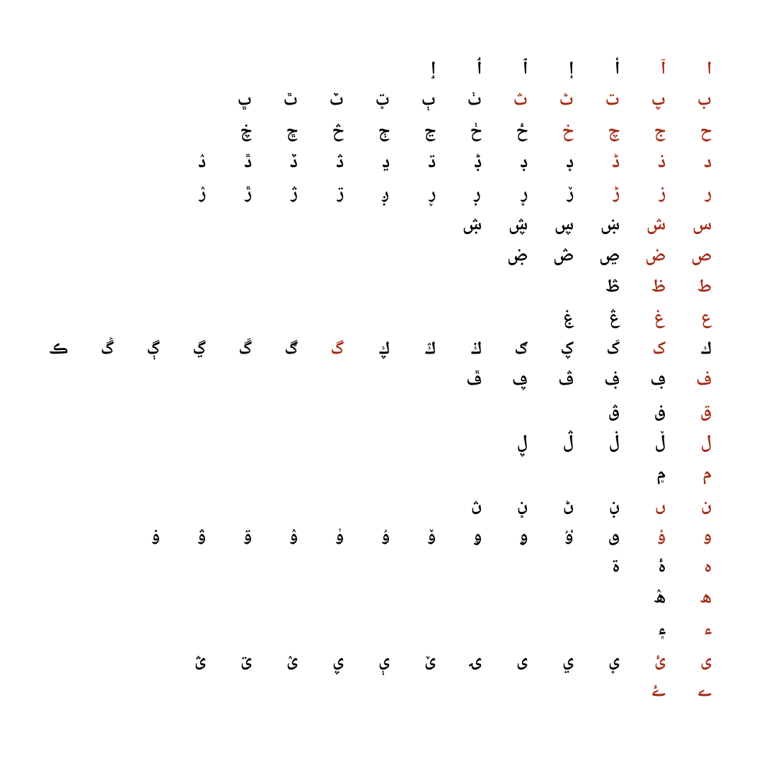
The Arabic Script. This diagram showcases the basic shapes of the Arabic script represented in Unicode. Each row corresponds to a rasm and each letter in every row represents different use of ijam to showcase difference in consonants. The letters in red are used in Urdu. Typeset in Noto Naskh Arabic.
Fundamental to understanding the difficulties of the translation of Arabic script to technology however, is its cursive nature. When written, letters in the Arabic script are joined together with adjacent letters. Some letters join only backwards, some only forwards. Most join both ways. As a result of this joining the letters of the Arabic script can take a variety of shapes. Some take on incredibly different forms than their shapes when isolated. The letter ع for example, when in the middle of a world will take on an ﻌ shape.
※
Difficulties of Arabic Typography
The core issues of typesetting the Quran in the Ottoman Empire and daily newspapers in Pakistan were the same – how to create a system of atomic, mechanical components that can systematically reproduce the Arabic script on paper with some semblance of aesthetic integrity. The difficulties of this challenge arise from the cursive nature of Arabic script.
It is worth digressing here into some very basic concepts of Arabic calligraphy so as to get a sense of why Arabic script in particular challenges printing technology in a way that Latin script does not.
Traditional Arabic calligraphy can be roughly described as a system of rules that identify how different letters should be proportionally sized, and then placed in words next to one another. These rules were established as early as the tenth century. For context the vocalizations of consonants as ijam on the rasm began to start a process of formalization in the seventh century, and diacritics began making their way into Arabic script in the eighth.
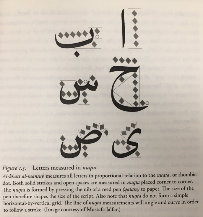
Arabic letters shown with proportional relationships (Osborn, 35)
The rules of Arabic proportional type are not one system of rules that produce similar looking typography. Rather multiple calligraphic styles have developed across time and geography that play with different sizes, placement and shaping of letters to create distinct styles. Within each style there is room in the rules for individuals to establish their own personal identity as calligraphers.
The Arabic language in its most accessible form is written in the naskh style of calligraphy, which became dominant as a result of its ease of legibility to broad audiences. Most modern Qurans are calligraphed in a style that descends from naskh. Persian, and subsequently Urdu, adopted the nastaliq style of calligraphy. One of the major differences between both styles is that while naskh calligraphy presents each word on a somewhat horizontal baseline, the nastaliq style has each word displayed as a hanging, angular style. With the first letter usually positioned the highest, and the word sloping gradually downwards such that the final letter ends up on the baseline of the text.
Given these basic rules, calligraphers make an infinite number of optimizations with every word to make the overall aesthetic quality of the text. So the same letter even in similar form (such as at the beginning of the word) will look slightly different in every word. This is compounded further by the fact that since each word in cursive takes on a shape of its own, that words can also be shaped so as to make them more recognizable and legible such that the reader may get an extra signal not just from the shape of the letters but also from the shape of the word itself.

Varying styles of naskh calligraphy (Osborne, 39)

The same line of text set in a calligraphic naskh style (top), a nastaliq style (middle) and a simplified naskh style (bottom). The fonts used are Decotype Naskh, Noto Nastaliq Urdu, and Noto Naskh Arabic respectively.
What all of this means is that when analyzing any piece of calligraphic, hand-written text in the Arabic script, each letter will take a number of forms. To convert this into a mechanical system of reproduction requires that each variant of shape be translated into a mechanical form (such as a metal ‘sort’) that can then inscribe marks on paper. The cursive nature of the script however implies that it is not just the shapes of the letters that must be taken into account but their connections to letters preceding and succeeding them. This can get unmanageable very quickly.
The first attempts at producing Arabic movable type hence simplified these calligraphic forms into ones with less variation such as to reduce the mechanical complexity of the final typesetting – simply by reducing the sheer number of varieties of letters a typesetter may have to deal with. In a sense this is like trying to recreate an ornamental piece of carved wood furniture with Lego blocks.
Sadly this need to simplify did not end with the first attempts at movable type. It continued into more advanced printing methods such as linecasters and photocomposition machines, but then also into typewriting. The core problem through each of these technological mechanisms is the same – the number of shapes a typesetter (human or machine) could deal with was limited. Despite being only a few dozen letters, the letters in the Arabic script demanded a large number of shapes to be represented calligraphically. Hence the variety of calligraphic forms was hard to reproduce in mechanical technology.
To solve this problem, various attempts were made in the mid-nineteenth century to simplify the Arabic script. It is worth noting that few, if any attempts were made to change machines for printing and typewriting such that they would better manage a large number of letter shapes. Instead designers in the Arab world and beyond engaged in efforts to simplify the Arabic script itself.
A particularly striking proposal was Nasri Khattar’s Unified Arabic – Khattar proposed that Arabic get rid of cursive entirely. Instead, each letter would use a modified version of its isolated shape, regardless of where it was in the word and what letters were adjacent to it. All characters were written on a common baseline. Their widths changed so as to be more uniform; traditionally, the Arabic rasms vary drastically in their width.

Unified Arabic
The top left is Arabic script as traditionally written cursively with the same three letters ordered differently in each line. Top right the same combinations of letters in Unified Arabic. Bottom is text typeset in Unified Arabic.
Khattar’s proposal was presented as a grand modernist project to fight illiteracy by removing the complications of cursive from the Arabic script, which required learning not just the letters themselves but also to learn how to identify a letter in one of the many forms it could take in cursive writing.
While Unified Arabic ostensibly used Arabic letters, really at the core of it was no longer Arabic script at all. It was Latin script. With a different form of letters designed to fit technology built for the Latin script. It is easy to see how the needs of a typewriter influenced Unified Arabic. A typewriter requires that the number of shapes that can be drawn be kept manageable so as to fit into a compact machine. Because that was the social imagination of a typewriter – a set of keys on a machine small enough you could pick it up and put it somewhere else. One could imagine that a typewriter might have been a larger object, or might have looked like something else entirely. But our imagination of what a typewriter looks like is dominated by our image of a typewriter for Latin script. And our imagination of what a keyboard looks like is constrained by these early typewriters as well.
This view of modernity, of progress, of technology was so constrained that part of the revolutionary actions of Mustafa Kemal Ataturk’s formation of the Turkish secular state was the abolition of Arabic script – getting rid of “incomprehensible Arab characters” to join “the civilized world” (Nemeth, 83).
Around the time when Arabic script reform projects were being launched in the Middle East, another language was also figuring out how to atomize its representation for reproduction in typewriters: Chinese. Yet the world of Chinese typewriting was not nearly as constrained by the image of a keyboard with a few dozen keys in a machine you could pick up and put anywhere on your desk. Since Chinese writing required the use of a few thousand characters at least, the notion of a traditional typing interaction where you hit some key and that key directly translates to the transcription of the character was inconceivable in a world where you only had the ability to fit a few dozen keys.
In a sense the fact that Arabic only has a few dozen characters that only take different shapes, gave Arabic designers an easy way out, but also trapped them. They decided that getting rid of some of these shapes would still leave the language intact. This meant easier adaptability to Latin technology, but also that Arabic would also irreparably lose its aesthetic character. Chinese had no such out. As a result just a year after the Arabic Script Reform Competition was opened by the Academy of the Arabic Language, Cairo (Nemeth 85), a Chinese writer by the name of Lin Yutang developed the Mingkwai typewriter.

The MingKwai typewriter (see Thomas Mullaney's The Chinese Typewriter, 244).
This typewriter proposed a new atomizing mechanism for the Chinese script. Characters were broken down into their component strokes, and some combinations of strokes were chosen to correspond to keys on a keyboard. Pressing a pair of these keys would bring up 8 candidate characters into a ‘viewfinder’, and then a number key was pressed to select one of these 8 characters. While the Mingkwai typewriter never itself made it very far due to a failed prototype demonstration with typewriter maker Remington, the concept of it is so mind-boggling that it endures as an image of daring design, especially after Tom Mullaney’s digging up of the history of Chinese typewriting last year in his book The Chinese Typewriter. In abstract terms, the Mingkwai typewriter built mechanical autocomplete, decades before the Western would start seeing software based autocomplete in the mainstream on their smartphones. And despite Lin Yutang’s specific design not enduring, an important abstraction of his design has sustained in all Chinese typing to this day (263-281).
This was the idea that Chinese typing would not be an interaction where the hitting of a key would directly transcribe a character, but that the act of typing in Chinese would be an interaction of character retrieval. Another action would have to be taken after this retrieval to actually transcribe the character – onto paper or on a digital screen. Mullaney calls this idea ‘input’.
I make this digression into Chinese typewriting to indicate that just like Arabic, other languages were dealing with how to adapt to typewriting at just the same time. And the different choices made in other language systems provides evidence that there was room in technological terms to explore radically new conceptions of what a typewriter or for that matter even what printing was supposed to be. It will be no surprise that after Gutenberg, European printers would make the argument that Chinese – the language of the land that invented movable type – was not fit for printing (Mullaney, 81-84). That designers chose to simplify the Arabic script to fit the technology they had at hand was a design choice, not a technological imperative.
Regardless, Khattar’s Unified Arabic never got much farther than a dramatic proposal and the Academy of Arabic Language’s Competition winded down after a few years with no winner. Even more drastic proposal than Khattar’s – such as getting rid of not just cursive but also the Arabic letter shapes and instead using modifications of latin shapes to approximate Arabic letters – also never became mainstream. But a few simplifications designed during this time live to this day. To reduce the number of letter shapes, or ‘sorts’ that would need to be typed on a typewriter, designers across the Arab world proposed typefaces that required only a few variations of each later. One such example is ASV-Codar, which took the naskh style of calligraphy, removed essentially all variation of letter shape and position and provided shapes that all sat on the same baseline and connected predictably forward and backwards with hanging connectors. Through political and economic connections ASV-Codar found widespread use, and similar schemes were developed that gained traction where ASV-Codar did not. But the basic idea sustained – remove enough variability in the letter shapes and positioning that the same shape could be expected to cursively connect to adjacent letters without having to worry about the word or the specific letters in it.

ASV Codar (Osborn, 147)
As we moved from the age of mechanical printing and typewriting into digital computing, the physical limitations of managing so many sorts have disappeared. But the ease that the simplification of letter shapes has afforded designers meant that digital typefaces are still often closer to ASV-Codar than they are to the calligraphic mode of proportional naskh designed in the tenth century.
In ASV-Codar and similar simplifications, Arabic letters were simplified to having in addition to their isolated forms: an initial, a medial and a final form (each corresponding to their position in the world). In calligraphy, letters of course take many more than four shapes, and these shapes also are at varying distances from the baseline depending on the word. But typewriting simplified Arabic script to these four abstract forms. Even in Unicode today – Unicode is the global standard for representing characters of the world’s language systems in computing code – despite the fact that we are past the point where managing a large number shapes for each letter is cumbersome (since the computer is doing it anyway without human involvement), this four-part formation of Arabic script remains.
※
The challenges of Urdu – nastaliq typography
The nastaliq style of calligraphy presented an even greater challenge for Latin-centric technology. Of the differences between naskh and nastaliq the slanting, or hanging form of every word was a particular difficulty. Because this required that systems such as typewriters modify not just the horizontal position of where a letter was placed, but that in any word they also significantly alter the vertical positioning of each letter in relation to the baseline. This movement of course also changed how the letters could connect cursively to adjacent characters, and so the translation to chosen technology was not as simple. This is a gross simplification of the challenges of nastaliq typefaces but will suffice for the purposes of our discussion.
For decades after Pakistan’s independence, Monotype and Linotype (the predominant companies of printing technology and typeface design) developed typefaces for the Urdu market that were consistently unaccepted. Pakistani publishers insisted instead on handwriting their publications and then lithographically reproducing them. Lithography allowed the projection of light through a negative onto paper, much like film photography, to reproduce the handwritten text.
The other language to use the nastaliq calligraphic style, Farsi, took another route. Farsi publishers began to work with custom typefaces that were simplifications in their own right and lost the particular style of nastaliq but were developed in close collaboration with aesthetes of the Farsi language such that even in this simplified form the letters retained some identifiable Farsi character, distinct from an Arabic character which defined much of the type design that was prevalent in the work done with Arabic script. Two typefaces developed during this time gained widespread prevalence and continue to be used to this day, accepted by Farsi audiences as a representation of their language in print (these two fonts are Mitra and Nazanin, see Nemeth, 285-318). As a result Farsi newspapers today look drastically different from Urdu newspapers – largely due to typographical choices – despite Urdu inheriting much of its linguistic and aesthetic tradition from Farsi.
Two watershed developments were made in the 1980s in the realm of Urdu typography. These were the design of two typefaces – one each by Monotype and Linotype, for two Pakistani newspapers, Jang and Nawa-i-Waqt respectively. Linotype produced a typeface called Sheeraz, which was iterated upon later and became a typeface called Qalmi. Tim Hollway, the British designer of Sheeraz, along with a software team produced what is considered by Nemeth and many others as one of the crowning modern achievements not just of Urdu typography, but of type design in the Arabic script at large. Holloway developed a system through which he atomized the nastaliq style of calligraphy into a scheme of vectors. Through the use of custom code developed in accordance with the design, these vectors could be placed together to produce whatever word without prior knowledge of what the word was. Built into Sheeraz for example, was the slanting nature of the nastaliq script. As a word would by typed, its first letter would be placed higher from the baseline. But Holloway’s system of vectors and custom code would not only dynamically change the horizontal and vertical positioning of the letters, but adapt the connections between them such as to express infinite variability in letter positioning and shape with a manageable set of abstract shapes that could be put together to respectably reproduce any word in nastaliq style (Nemeth, 368-382).
Sheeraz as a technological project was not just the vector shapes, but the combination of vector shapes and the custom software that combined these shapes. Traditionally printing, by which I mean printing designed for Latin script, divorced the concept of vectors from the actual typesetting software. While each typeface would come with its set of guidelines of how far away letters should be placed from each other and what sizes text should be typeset in a particular font, typefaces for Latin script were essentially only vectors with no code dictating how to place them. A machine would use the same code with multiple typefaces to typeset characters. As the worlds of printing and digital computing moved to find a standardized way of addressing how to put shapes down in an interchangeable format, they came up with PostScript. PostScript became the standard of how text and graphics should be laid out, but PostScript had no conception of a typeface that had its own custom code of how it should be laid out. Consequently, as the technological march dictated by Latin script moved forward into the age of computing, Sheeraz was made obsolete (Nemeth, 454-455). To this day the ingenuity of Sheeraz’s system has not been reproduced in any typeface.
Instead what survived all of this was Monotype’s typeface, Noori Nastaliq. Noori Nastaliq is the default Urdu font. It can be seen everywhere – from the Jang newspaper it was built for which still uses it, to nearly every book printed in Urdu, to television, advertisements, road signs, on the internet, Noori Nastaliq is synonymous with a printed, or digitally reproduced version of Urdu. So important was the creation of Noori Nastaliq that its designer was awarded one of Pakistan’s highest civilian honors for producing a technology of deep national interest (see further in this celebration and history of Noori Nastaliq by Elite Publishers).
Noori Nastaliq was produced in collaboration with Monotype by an enterprising set of designers based in Pakistan. The method they adopted was to convert their study of nastaliq calligraphy into a set of handwritten ligatures that were then converted to vectors that went into the typeface. By some accounts Noori Nastaliq was made of about twenty thousand such ligatures (combinations of letters that can be represented by a single vector). As such these vectors together covered the combinations of letters that would be seen commonly in printed Urdu. In simpler terms, Jameel Noor (the principal designer of Noori Nastaliq), made up a set of all the words words he could find in the Urdu language, produced calligraphic forms for all of them, and that’s what made up Noori Nastaliq. Because the choice of these letter combinations was based in an analysis of the language, Noori Nastaliq could not write any arbitrary collection of Urdu letters. New words that Noor had not preempted could simply not be typeset because the required vectors were not part of the typeface. So in newspaper issues that used early versions of Noori Nastaliq, uncommon words such as transliterations from the Latin script or new technical terms would have to be written either in another typeface that allowed for such flexibility, or to be handwritten. Of course since Monotype and Linotype machines were not interchangeable, Jang couldn’t just replace Noori Nastaliq with Sheeraz when it needed to type in a new word that Noori Nastaliq didn’t support. Instead, when the words weren’t handwritten they were typeset in one of the simplified approximations of the naskh style mentioned earlier, typefaces which had been rejected as unfit for Urdu printing for decades prior (Nemeth, 346-352).
If you pick up an Economics, or Mathematics textbook written in Urdu, you will find that both use Urdu technical vocabulary to refer to core concepts. But any documentation of the fields of Information Technology or Computing, will inevitably use terms that are transliterations of their English terminology. At times these will be typeset in Latin characters, at others in Urdu. But regardless, there is no Urdu term for ‘Information Technology’, or ‘Computer Science’, or for that matter programming, code, email or the internet. Is it a coincidence that the one major field of our time that developed after the mainstreaming of a typeface that couldn’t print new terms took shape in Pakistan without the creation of new words to describe it? What’s the point of creating new words to describe new things when you weren’t able to write them anyway? If publishers were going to have to typeset words in a typeface deemed unfit for Pakistani audiences, why not just typeset them instead in Latin characters which at least represent some form of orthographic integrity? So prevalent became this desire to print in Latin characters in the middle of Urdu text that it remains one of the main requirements of Urdu speakers today. When work first began an Urdu phone keyboard (that would turn into Matnsaz), I interviewed dozens of people about their difficulties in typing in Urdu. Numerous subjects mentioned that it was too hard to insert Latin characters in Urdu text.

The use of handwritten text (left) and typeset text (right) (Nemeth, 351).
There are several threads to this story. The paucity of technological solutions to the problems of Arabic typography, specifically to nastaliq typography which served as the greater challenge. The obsolescence of Sheeraz – the more flexible, more daring of the two breakthrough technologies in nastaliq typography – because the design of Sheeraz existed outside the frame of a technological world made seen through the eyes of the Latin script. As a result the written tradition of the Urdu language was dominated by one, inferior technology that through its design was unable to handle a transformation of the Urdu language. Simply because it had no capability to type in words its designer did not foresee. Consequently the very fabric of modern Urdu was rendered incapable of dealing with a world of accelerated technological progress in the digital age. It is easy to see how this connects to Pakistani Minister Ahsan Iqbal’s assertion that a forward-looking education system must integrate English technical vocabulary with Urdu narrative. That while Urdu remains the dominant mode of communication (after the political replacement of the Devanagri script with the Arabic script rendered the written traditions of many regional languages moot), it is English that must be used for technical vocabulary. Modern Urdu typography, even versions of Noori Nastaliq can write new words. But the damage was arguably irreparable. The population was split into two groups. One that could read English and hence were able to decipher, internalize and use technical terms, and the technology behind them. And the second that was left to figure out what to make of Latin characters in the middle of their Urdu text. The displacement of Urdu-medium individuals in an English-medium music festival is a strangely appropriate analogy.
※
Typography on computers today
When modern personal computing took shape in the eighties and nineties, the input of text into the machine was considered a solved problem. Modern QWERTY keyboards draw directly from typewriters. Of course elemental problems of other scripts had not been solved. One of these problems was how the characters of various scripts would be translated to the 0s and 1s of computing. Early computer scientists had encoded the letters of Latin script as ASCII, the American Standard Code for Information Exchange. ASCII took Latin letters (upper and lower case), numerals, elementary punctuation and common keyboard keys such as shift and backspace and encoded them into a table of numbers through which computers could then exchange text between various programs on the same machine, and across machines.
Scripts across the world began to come up with their own encoding schemes for their own characters, and the result was a non-standardized set of character encodings that made it near impossible to reliably share information between computers. The Unicode Consortium was founded in the early 1990s to standardize character encodings for all of the world’s writing systems, and it would take the next two decades for Unicode to become the default character representation across modern operating systems.
Alongside the launch of Noori Nastaliq came the computer program InPage, which was used by Urdu publishers to typeset the Arabic script. InPage and Noori Nastaliq were released prior to Unicode, and hence at that time were true innovations in creating a usable mechanism for inputting Urdu into modern computers. Without Unicode, it meant that you couldn’t just send someone the text you’d typed into InPage however, and so InPage came with a built in function to export the text as an image. For the longest time Urdu newspapers, even after the mainstreaming of Unicode continued to post articles as images.
As I interview people today about what makes it difficult to input Urdu text into their computers and smartphones, I often run into people who ask me: don’t you need InPage to write Urdu? Of course the answer is you can write Urdu on any modern computer in any modern piece of software, but general conceptions continue to believe that Urdu requires specialized software because traditional software will not cut it.
This holds true of typography as well. Most modern computing interfaces use a default typeface for the Arabic script that draws directly from the simplifications developed for typewriters like ASV-Codar. While this simplification of typeface seems to receive some acceptability in the Arabic-speaking world, Urdu speakers find it prohibitive. This is the exact same reaction we saw with the newspapers, and like the newspapers, many Urdu speakers would rather use their phones in English or in Urdu transcribed in the Latin script, than to use Urdu in the default fonts offered by most operating systems.
A few years ago, a number of blog posts made their way across Pakistani social media lamenting this. Ali Eteraz, in 2013, published a piece titled “the Death of the Urdu Script”, calling for large technology companies to save Urdu from the “hegemony of the Western alphabet and an overbearing Arab cousin”. Eteraz and others call this overbearing Arab cousin ‘naskh’, but what they are protesting against is not naskh at all, but a brutal approximation of naskh built for typewriting and never fixed since. Mudassir Azeemi published an open letter to Apple’s Tim Cook and Jony Ive the year after, asking for them to provide the nastaliq style as a default for Urdu on Apple’s mobile operating system iOS. Neither article makes any specific reference to what typeface could be used, and it is not entirely clear where this typeface should come from. Of course Pakistani software developers could develop typefaces and software of their own, InPage showed that was a possibility, though InPage was developed in India not in Pakistan. Azeemi and Eteraz are asking for system level support, which is fair, but there was little well-known work done in the Urdu speaking world to better represent Urdu in technology, let alone from Western tech companies.
To this day, nearly all Urdu typefaces have been developed by or at least in collaboration with Western type foundries. Only one typeface, Mehr Nastaliq, has been developed entirely locally under the auspices of the Punjab Information Technology Board, a technology wing of the Punjab Government in Pakistan.
In 2017, after what Azeemi reports as multiple betas in years prior that experimented with nastaliq, Apple released a version of iOS with nastaliq as a default option for Urdu text in iOS. Azeemi was as a result hailed as a hero and pioneer across many technology blogs and newspapers. One asked Azeemi if he planned to bring nastaliq to other platforms as well. This narrative unfortunately hides the human and technical processes beyond consumer activism (which Azeemi provided leadership for): the development of the typeface, the operating system, and the integration of both.
The current typeface used by Apple in their operating system is surprisingly owned by Google, a staunch competitor in many fields and upon whom Apple has worked hard to reduce their dependence. Google owns the typeface in question – Noto Nastaliq Urdu – but it was seemingly designed in collaboration with Monotype. There is no publicly available information that any Pakistani was involved in the development of the typeface.
The integration of the typeface in iOS is either half-hearted or careless. Most modern computing interfaces are built for Latin interfaces, and hence text in interface elements and in open text fields is sized so as to be legible when representing Latin characters. The size of other scripts is built around this starting point. The nastaliq style, because of its height renders important character forms at small sizes and is hence often incredibly hard to read in Apple’s system. Further, because of its slanting baseline, words will often exceed the bounds of text boxes meant to represent text that is consistently horizontal. Ironically the Urdu word for ‘complete’ fails to completely fit in Apple’s bubbles for text messages.
Have we simply by using nastaliq but by not adapting any of the technology surrounding the nastaliq to the needs of the Urdu text it represents, really succeeded at anything? It appears Apple is uninterested in solving these issues in their entirety, or is perhaps simply unaware. Google, the other major mobile operating system manufacturer, chooses not to use nastaliq for interface elements despite having developed the canonical font which may now replace Noori Nastaliq as the default for Urdu. In interface elements, Google continues to use variations of the naskh approximations which better fit into Latin interfaces due to their more horizontal baselines.
As a result of all this, it is easy to see why the thousands of paper cuts of using Urdu technology (and this is only the surface of it both literally and figuratively), continue to further a belief that Urdu will always be unfit for modern technology. When the truth is that modern technology has never even wholeheartedly attempted to be fit for Urdu. Modern technologists, especially Urdu speakers, continue to live in a world where they are hoping some magical lament to large technology companies will bring forward a revolution. Will this revolution ever by typeset?
––
Update Aug 9 2018: A sentence suggesting that regional languages such as Punjabi & Sindhi did not use Arabic script before Partition has been revised to indicate the multiplicity of scriptural forms the languages are likely to have taken.
Update Mar 30 2019: A number of sentences have been edited for clarity.