Alpha 2 Launched
A few days ago I sent out the second major build to a few close testers. Note this is still not the public beta that many have signed up for, but an earlier alpha release that has a few more bugs and loose ends than a public beta should reasonably tolerate.
Once past initial testing, we'll add a few more features and launch to everyone that's signed up for the public beta. That said, if you are brave and would like to be part of the private alpha do get in touch!
Given the number of features in this release I wanted to write a few notes about their development. Many of the questions that the development of these features raise are larger questions about Urdu typography and interface design. As such I would benefit from thoughts and feedback and I am hoping the resultant discussion will put the community in a better space with regards to our collective learnings and opinions about Urdu software.
So new in Alpha 2 are the following big features.
Contextual Letter Forms
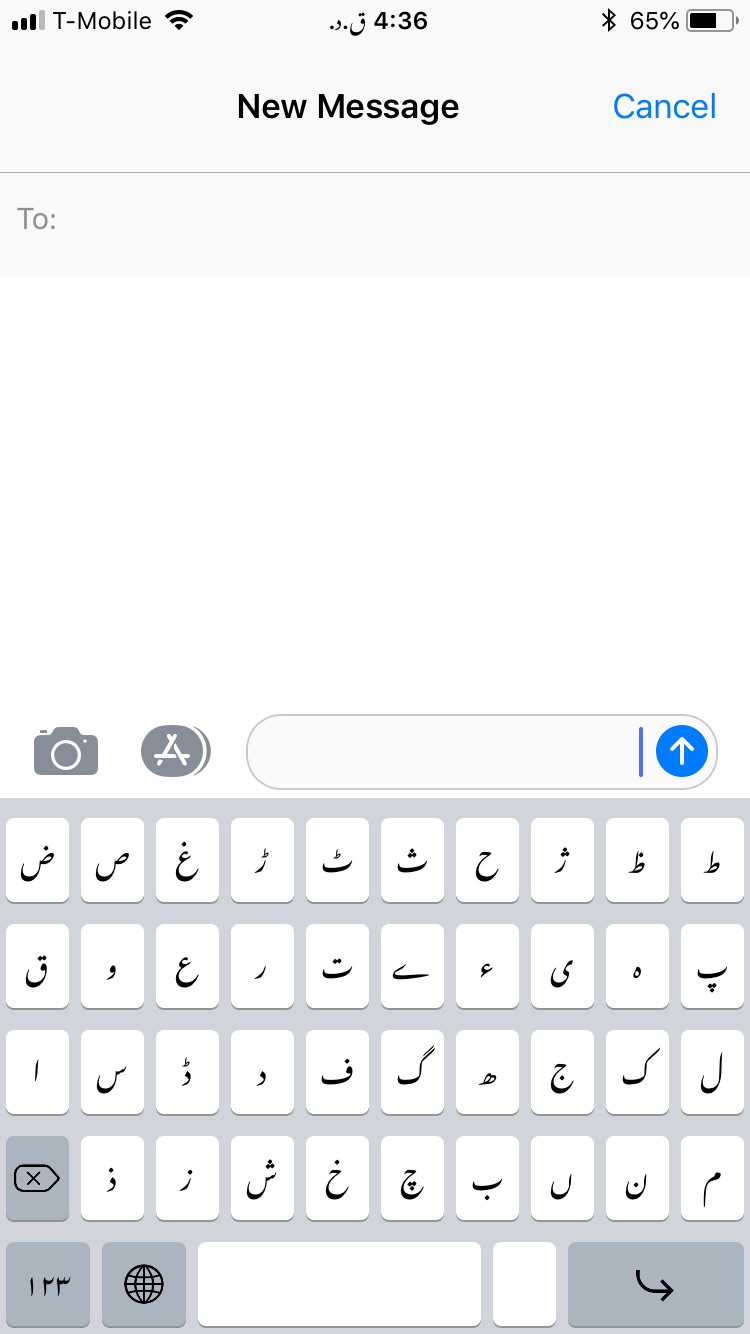
As shared in the notes about the Keyboard that accompanied the launch of Matnsāz, one of the design spaces we are experimenting with is the use of contextual letter forms as labels on the individual keys.
The Arabic script's cursive nature means that the same letter takes different shapes depending on where it is placed in a word. These forms are often simplified to an isolated form, and then forms taken in various cursive combinations depending on the placement of the letter within them: initial, medial, or final. Depending on what calligraphic tradition one follows, a letter may take a number of initial, medial or final forms depending on the letters around it, available space and other aesthetic constraints. For our purposes we'll continue to operate with the simplified 4-pronged model of contextual forms for now and then can make this more complex later.
The idea of using the contextual forms as labels, instead of the traditional isolated forms, is so as to display what the actual inscription of the character will look like before pressing the key. It is an intrinsically more clear representation of the underlying action. This should also make it easier to predict and avoid errors in spelling because letters do not take on shapes that are unexpected. Theoretically this also allows the user to inscribe characters as they would when handwriting, without having to abstract between the isolated and contextual forms of letters.
Initial letter forms displayed as key labels
A video demonstration of how key labels change as a sentence is typed
There are a number of interesting design and technical challenges to make this work.
The most noticeable one is that the space bar and the zero-width non-joiner key (more on this key below) both display the final form of the letter just typed. The reason for doing so is that while the keyboard can know whether you are starting a new cursive form or are already in the middle of one, it cannot predict whether or not you intend to end that form. So pressing the traditional letter keys inscribes the initial or medial forms of the letters, but it is through the use of the space and zero-width non-joiner keys that the user can signal to the keyboard that they intend to end the current cursive form and hence ask the software to inscribe the final or isolated forms of the last letter typed.
Of course for this feature to be useful the key labels should display graphemes as close to the form they will be inscribed in. That is, they should display in the same typeface as the inputted text will be displayed in. Unfortunately modern software has enforced fairly strong divisions between underlying characters and their visual representation. All the way down from how Unicode interacts with font files, up to the APIs available to application developers, the typeface and underlying characters have been separated. This philosophy continues into keyboard development, and it means that on iOS there is no way for a keyboard to figure out what font the text will be written in.
Why has this happened? Because in most scripts the assumption is that that the choice of typeface or calligraphic style will not change the character enough to meaningfully warrant a more complicated technical relationship between typeface and underlying characters. The cursive nature of the Arabic script, and its variety of calligraphic styles, makes this relationship much more important.
Unfortunately what this means for now is that I guess as the keyboard developer what typeface the resulting text will be displayed in. Most iOS devices will display the Arabic script in Apple's custom typeface, San Francisco (which has an Arabic variant). If you have Urdu enabled as a preferred language however the Arabic script will be displayed in Google & Monotype's Noto Nastaliq Urdu typeface. So I use the user's language settings to infer which of these two typefaces to use for typography on the keyboard. If an app is using a custom font for Arabic script (which is unlikely but not guaranteed), then the keyboard's typography will not match the inputted text.
Displaying the actual contextual forms is also non-trivial. While Unicode contains these contextual forms as separate characters for most of the Arabic script, many characters do not have corresponding contextual forms as separate characters (such as the Farsi Yeh). Some characters do have contextual forms, but they are incomplete (The Noon Ghunna for example is shown as having only an isolated and final form, but in some Urdu typography and typefaces and nasal sound is indicated with a Noon with a nasalization diacritic above it. In some cases this is written as a as a literal Noon character and a Ghunna/nasalization diacritic, but in other cases it is written as a literal Noon Ghunna character that may display a medial form. This latter case is what we see with the Noto Nastaliq typeface, while Apple's San Francisco does not display a medial form for the Noon Ghunna character. Matnsaz takes all of these discrepancies into account). While we could use these Unicode characters for each contextual form to display them, the Noto Nastaliq typeface does not tag its glyphs as corresponding to these Unicode characters – implying that just by writing the character we will not get the correct glyph from the font and they will display in San Francisco instead, where they are correctly tagged. Noto Nastaliq likely has omitted these connections assuming that these contextual forms will not be used as Unicode characters for any actual typographic work, which is a fair assumption for most text in the Arabic script but fails our purposes. The final solution for us is a hack that uses the Unicode Tashkeel character. The Tashkeel is used to indicate an elongation of cursive connection between two letters. While most typefaces do not actually interpret the Tashkeel in this way, adding a Tashkeel to a character without adding another character immediately adjacent displays the contextual form of the character.
At the moment the contextual forms shown on the key labels only take into account whether the current letter form will connect to the preceding shape. It does not take into account what that shape is.
From initial testing it is clear that the cursive letter forms are perhaps too small for the keys and need to be a little bigger to be legible. But also that this is a non-trivial change that takes some getting used to.
Settings
Given that cursive forms might be a strong personal preference, and pre-empting the need for configuration during text input – such as the use of diacritics – a settings screen has been added to the keyboard.
Ideally these settings would be in the iOS Settings apps, alongside keyboard settings for the iOS system keyboard. While Apple also recommends that is where infrequently used settings live, their API to make this happen is non-functional. Some research suggests this has been the case for many years. The other option was to add these settings in the iOS Settings app but under the Matnsaz host app (instead of the keyboard extension that comes bundled with it), or inside of the host app itself. Both however require that the host app and the extension communicate, for which the user must grand the keyboard extension and host app 'Full Access' to input text, including the ability to transmit said text over the network to other servers. I do not want to know what you are typing in other apps, and so refrained from asking for 'Full Access'. This meant that settings had to be built into the keyboard itself.
One important clarification here is that the launch of the public beta will be accompanied with a research study of these designs. The goal of this research study is to measure the speeds and accuracy achieved with these keyboard designs. For this study only, details about how participants use the keyboard such as what keys they press and how fast will be shared with the research team. This will happen only after consent from the participants and only for this research study and not for any other input text.
Settings showing options for key layout, and key labels
Video showing how to change settings
Phonetic Mapping to QWERTY as a Keyboard Layout Option
A number of requests were made to me to add the option of a keyboard layout that is close to the standard suggested by the Pakistani government, which is a phonetic mapping to QWERTY.
The current iOS keyboard for Urdu uses this layout, with characters that would not fit on a traditional QWERTY keyboard (due to there being more letters in Urdu than keys on a Latin keyboard layout), being placed behind the shift key. Android offers two keyboard layouts for Urdu – one for Pakistan and one for India. The 'Urdu (Pakistan)' keyboard offers the mapping to QWERTY with letters that would otherwise be demoted to being behind the shift key as an extra layer on top. The 'Urdu (India)' keyboard is alphabetically ordered, like the current Matnsaz default.
However there are some more details that are also non-trivial about these layouts. In the Android keyboards Alif with Mad ( آ ) is treated as a separate letter, while the Jeh ( ژ ) is not. All of these keyboard layouts do not display an isolated Hamza ( ء ) and instead display a Yeh with Hamza ( ئ ) which is used to to add a medial hamza. Matnsaz makes the decision to show the Jeh in the primary layout, and to show the Mad as a diacritic option along with other diacritics. The Hamza is displayed in its isolated form, but when being used in the middle of a word automatically changes to a Yeh with Hamza. The Hamza can also be used in diacritic form in Arabic script, above or below letters. These use cases are not supported at the moment (but will be added soon hopefully). There are some cases where separate Unicode characters exist for letters with the Hamza diacritic, such as an Alif with Hamza above ( أ ), or Waw with Hamza above ( ؤ ). Matnsaz adds these characters automatically when the corresponding individual letters is typed followed with a Hamza.
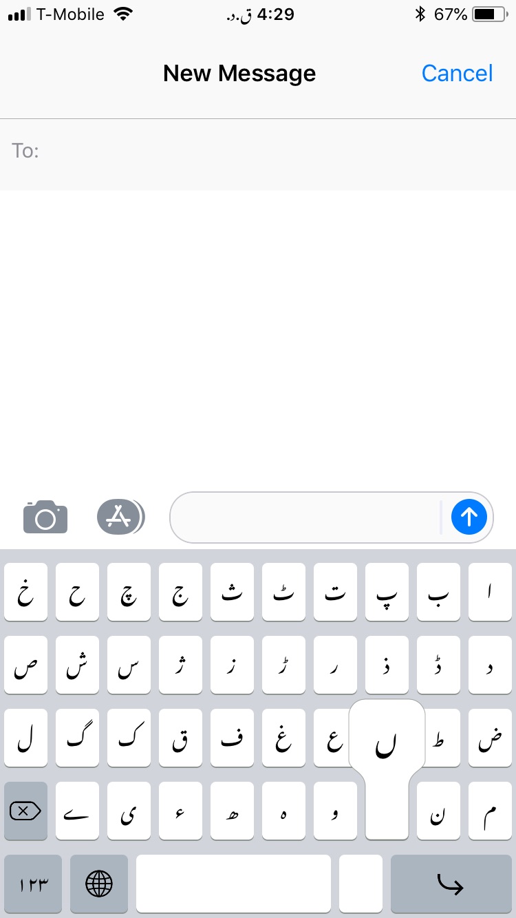
These complications aside, the Phonetic Mapping to QWERTY can now be used as an optional key layout. This follows the Android model where all keys are displayed on a single plane without the need for a shift key. But the layout is not identical to Android given some of the concerns mentions above.
Phonetic mapping to QWERTY as a key layout option
Key Titles & Key Press
A number of changes were made to the keys themselves.
Many keys, and the pop ups that display on key press, did not display their corresponding characters correctly in Alpha 1. The گ and the ں for example were not displayed in full. Unfortunately it appears that standard UIButtons in iOS have trouble displaying characters from the Arabic script, at least when displayed in Nastaliq, correctly with the built in title functionality. To fix this the titles were added to these buttons as custom UILabel objects while ignoring the built in title. This is just another example of poor Nastaliq and Arabic script support across iOS.
The key titles were also made adaptive to key and screen size, and on most devices will now show as a bit larger and easier to read than before.
The press states for keys will show a much more pleasing shape for the pop up now. This shape bends inwards from the edges, hides on larger devices as you'd expect from the standard system keyboards. Where possible design elements have been borrowed from the iOS system keyboards. These similarities are enforced to allow for easier multilingual phone use, and to not ask for special user adaptability when using Matnsaz. This also lowers learning cost and friction when using Matnsaz or switching to Matnsaz.
Matnsaz Alpha 1
Matnsaz Alpha 2 (Note changes in key press state, as well as typographic improvements such as on the گ)
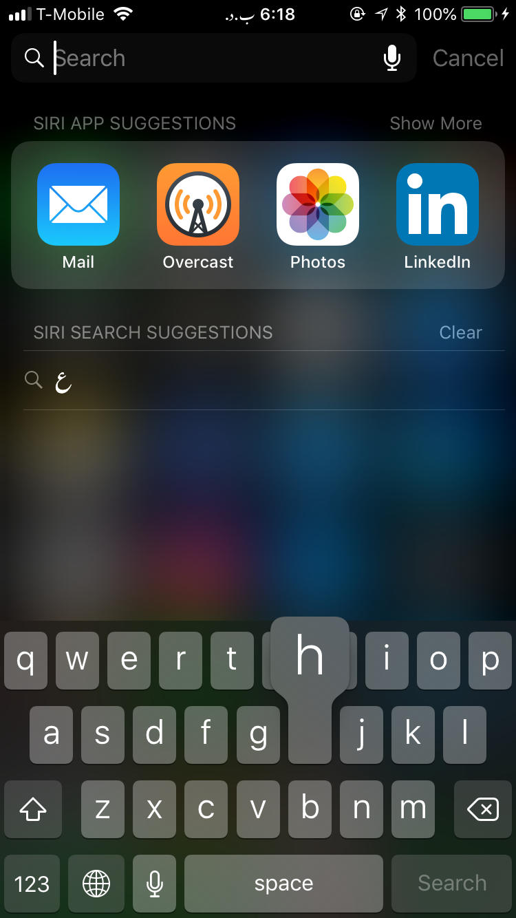
One detail that took some particular engineering work was ensuring that Matnsaz displayed well in dark mode, such as when using Spotlight on iOS, or in apps that ask for a dark keyboard. Even in Alpha 1, Matnsaz keys displayed well. But some icons only had dark line work and key press states were not dealt with correctly.
Icons have since been added to support dark and light mode, with some modifications to the icons themselves as well.
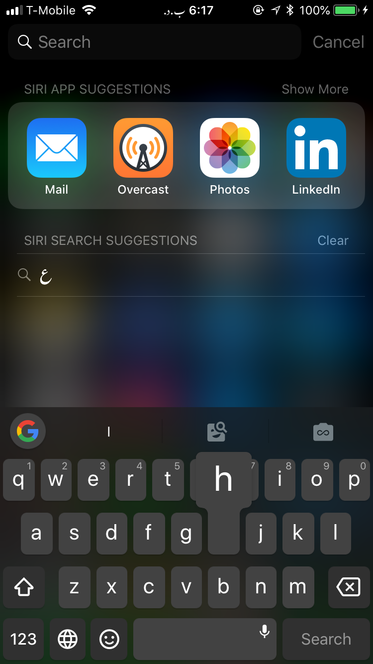
Key press states were an interesting challenge. The iOS system keyboard has translucent keys in dark mode. These keys reflect the color of elements underneath the keyboard. On press, the pop up also shows these colors but is not translucent to the other keyboard keys behind it. This was a non-trivial engineering solution, and most third party keyboards such as Google's below instead default to using solid colors – inviting undue attention to the change from the system keyboard. Matnsaz displays translucently as users expect from the system keyboard, using a mask on the rest of the keyboard.
iOS system keyboard in dark mode
Gboard in dark mode
Matnsaz in dark mode
Zero Width Non Joiner
Next to the space bar is a small blank key, which adds what in Unicode parlance is known as a Zero Width Non Joiner character. This character breaks cursive without adding a space, and is often needed in Urdu and Farsi typography but is never provided in keyboards. A common case where a zero width non joiner is needed is compound nouns, such as متنساز where two nouns for a single term, but do not connect cursively. In some literature on Urdu typography this is also called a 'soft space' as opposed to a 'hard space'.
Other changes
Some of these changes have been briefly touched on above but I'm mentioning them below for posterity
- Hamza merged with surrounding characters when possible.
- Key pop ups now show on punctuation, numbers and diacritics.
- Diacritics added – mad ( ٓ ) and sukun ( ْ ).
- Return, Keyboard Switch, and Number/Letter keys have changed positions to be consistent with system keyboards. This does mean that the return key is on the right, instead of on the left as one might expect if traditionally swapping layout positions from Left-to-Right to Right-to-Left languages. In practice it appears that enforcing this layout flip made the keyboard hard to use because of the nagging differences with other system keyboards. The Backspace is still on the left instead of on the right where it would be on other keyboards, and perhaps this should change too. At the moment it has remained on the left because moving it to the right would break the logical flow of letters especially in alphabetical layout.
- Text now displays in Noto Nastaliq Urdu if Urdu is in preferred languages, otherwise uses San Francisco.
- Can now hold on the Backspace/Delete key to bulk delete.
- Special keys (such as Return, Delete, Keyboard Switch, Number/Letter) change color on press.
- Diacritics have special typography to make them more legible on the keyboard.
- Better iPad layouts – still somewhat half baked but way better than Alpha 1.
- A dismiss keyboard key has been added to iPad layouts.
As always, would love to hear feedback on this build, and in general. If you'd like to help test the private alpha please do reach out. We could always use some patient and interested testers.


